The results are in! We received some amazing feedback on our recent poll about what to add to the blank space on the Basic tab of the Clients screen.
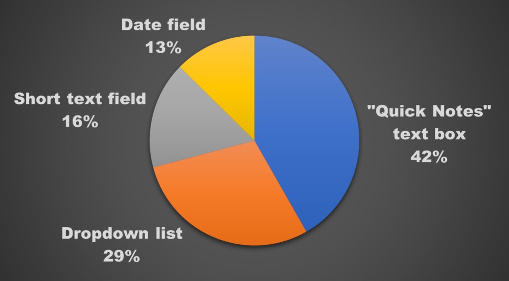
Nearly half of you asked for a “Quick Notes” box, which would allow entry of easily visible notes, reminders, and/or summary information as soon as a client’s record is accessed. We love this idea!
Many of you also suggested the ability to track various client details that could be set up in dropdown lists, short text fields (for both letters and numbers), and date fields. In the graph below*, you can see the breakdown of these suggestions:

*Please note that these percentages reflect only the responses that could be divided into these categories; there were other miscellaneous responses that are not represented in this graph. In addition, some responses were counted for more than one category.
Based on the size of the space we’re trying to fill, we might be able to include both a “Quick Notes” text box AND a few customizable fields for tracking individual data points. We’ll be working on this for our next version upgrade that comes out in August, so stay tuned!
In addition to notes and customizable fields, here are a few of the other suggestions we’ve added to our list of things to consider for the next upgrade:
- Fields for clients’ SSA identifiers: birthplace, mother’s maiden name, and father’s name.
- Preferred name field for clients.
- A visual indicator or alert when a client’s balance is over their limit.
- More information about a client’s marital status, like their marriage/divorce date and spouse’s name.
- Count of the number of items reconciled (on the Reconcile screen).
Thank you for each and every one of your responses! Your feedback helps us make RPM better, one suggestion at a time.

2 thoughts on “Poll results: Blank space on Clients screen Basic tab”